Slacktivity
I had an idea to make a heatmap of slack channel activity by each hour of the week, but didn’t know exactly how to make a thing like that. Slack lets you export public channel data, but I didn’t know what the format would look like, and I also wasn’t familiar with any good plotting libraries for heatmaps.
I thought it’d be interesting to do a little retrospective on how I was able to sit down at my computer and 20 minutes later have the exact data visualization I wanted. Along the way we’ll touch on a somewhat broad spectrum of Python data science libraries, each incredibly shallowly. There are some interesting problem-solving techniques, and some really bad choices.
Generating Fake Data
First, instead of making you download real data from some slack channels you’re an admin of, here’s a freebie script that will generate some fake data for you. It doesn’t make everything a real slack data download gives you, but instead has just enough for the project at hand.
import json
import os
import random

os.mkdir('channel-data')
os.mkdir('channel-data/general')

for day in range(10):
    filename = f'channel-data/general/2019-09-0{day}.json'

    num_messages = random.randint(5, 100)
    messages = []
    for _ in range(num_messages):
        rand_time = random.randrange(1567000000, 1568000000)
        messages.append({'ts': rand_time})

    with open(filename, 'w') as f:
        json.dump(messages, f)
The Evolution of a File
Normally, I’d consider it good enough to walk through the final script, but right now I’m more interested in telling the story of how I got to that point rather than just explaining the final product.
It started with something like this
import glob

for file in glob.glob('channel-data/general/*.json'):
    print(file)
This is more of a sanity check than anything, and tells me that the
files are in the right place. It also shows me that the file format
contains the date, so let’s parse that out. strptime and
its cousin strftime are my favorite way to handle date
parsing quickly when doing tasks like this.
from datetime import datetime
import glob

for file in glob.glob('channel-data/general/*.json'):
    date = datetime.strptime(file.split('/')[2].split('.')[0], '%Y-%m-%d')
    print(date)
Not that this parsing method of splitting by the second slash, then the first dot, is really silly and not robust. Luckily, it seems to work well enough here that we can just move on.
Once we have files opening, we’ll want to manipulate the data inside
them. Let’s load them as JSON and make sure that worked. I originally
printed all the data, but that output was overwhelming so I switched to
just its len.
from datetime import datetime
import glob
import json

for file in glob.glob('channel-data/general/*.json'):
    date = datetime.strptime(file.split('/')[2].split('.')[0], '%Y-%m-%d')
    with open(file) as f:
        messages_that_day = json.load(f)
        print(len(messages_that_day))
I still don’t know how to make a heatmap, but I do know how to count
up the number of messages on each day. Let’s do that with a
Counter and use day names (Monday, Tuesday…) as our
labels.
from collections import Counter
from datetime import datetime
import glob
import json

counter = Counter()

for file in glob.glob('channel-data/general/*.json'):
    date = datetime.strptime(file.split('/')[2].split('.')[0], '%Y-%m-%d')
    with open(file) as f:
        messages_that_day = json.load(f)
        counter[date.strftime('%A')] += len(messages_that_day)

print(counter)
We now actually have quite an interesting output, but I wanted to be
more granular than days. We can get down to hours by pulling them out of
the timestamp (ts) associated with each message.
from collections import Counter
from datetime import datetime
import glob
import json

counter = Counter()

for file in glob.glob('channel-data/general/*.json'):
    date = datetime.strptime(file.split('/')[2].split('.')[0], '%Y-%m-%d')
    with open(file) as f:
        messages_that_day = json.load(f)
        counter[date.strftime('%A')] += len(messages_that_day)
        for message in messages_that_day:
            message_datetime = datetime.fromtimestamp(float(message['ts']))
            print(message_datetime.hour)

print(counter)
We now pretty much have the data that we need in place, at the right
level of granularity, and in a for loop structure that’s at
least somewhat reasonable. We just need to figure out how to produce the
visualization. But first, we’ll need to put our data in a numpy array.
They’re kind of the basic unit of data science in Python.
Because there are 24 hours in a day and 7 days in a week, the row and
column sizes of the array are decided for us. Our dtype
will be integers, since we’re counting up the number of messages seen at
each hour.
from collections import Counter
from datetime import datetime
import glob
import json
import numpy as np

grid = np.zeros((24, 7), dtype=int)
counter = Counter()

for file in glob.glob('channel-data/general/*.json'):
    date = datetime.strptime(file.split('/')[2].split('.')[0], '%Y-%m-%d')
    with open(file) as f:
        messages_that_day = json.load(f)
        counter[date.strftime('%A')] += len(messages_that_day)
        for message in messages_that_day:
            message_datetime = datetime.fromtimestamp(float(message['ts']))
            grid[message_datetime.hour, date.weekday()] += 1

print(grid)
print(counter)
Note that there’s some weirdness—we access the hour as a property
with message_datetime.hour but the weekday with a function
call date.weekday(). Consistent interfaces are hard to care
about when you’re writing fast, ad hoc code.
We can now begin our visualization. I know Seaborn is cool for visualization stuff—does it have heatmaps? Sure does. Let’s copy in the parameters we want.
We’ll also set up axis labels. The one for hours is interesting. I
don’t want to write a function to convert from hour numbers
(e.g. 14) to human-readable hours
(e.g. "02:00 PM"), so I’ll just map a parse-reformat lambda
over the range from 0 to 24. Good enough.
The one for days is super boring and lazy. I’ll just type out all the names of the weekdays. There are only seven of them….
from collections import Counter
from datetime import datetime
import glob
import json
import numpy as np
import seaborn as sns

grid = np.zeros((24, 7), dtype=int)
counter = Counter()

for file in glob.glob('channel-data/general/*.json'):
    date = datetime.strptime(file.split('/')[2].split('.')[0], '%Y-%m-%d')
    with open(file) as f:
        messages_that_day = json.load(f)
        counter[date.strftime('%A')] += len(messages_that_day)
        for message in messages_that_day:
            message_datetime = datetime.fromtimestamp(float(message['ts']))
            grid[message_datetime.hour, date.weekday()] += 1

heatmap = sns.heatmap(grid, annot=False, fmt='d', linewidths=.1)
heatmap.set(title=f'#general messages by hour of the day')
heatmap.set(xticklabels=['Monday','Tuesday','Wednesday','Thursday','Friday','Saturday','Sunday'])
heatmap.set(yticklabels=map(lambda h: datetime.strptime(str(h), '%H').strftime('%I:%M %p'), list(range(24))))

print(counter)
I quickly google how to save a seaborn plot as a png, how to rotate seaborn’s y-axis labels so they’re readable, how to get better seaborn defaults, and how to resize the figure so it looks prettier.
from collections import Counter
from datetime import datetime
from matplotlib import pyplot
import glob
import json
import numpy as np
import seaborn as sns

sns.set()
pyplot.figure(figsize=(10, 10))
grid = np.zeros((24, 7), dtype=int)
counter = Counter()

for file in glob.glob('channel-data/general/*.json'):
    date = datetime.strptime(file.split('/')[2].split('.')[0], '%Y-%m-%d')
    with open(file) as f:
        messages_that_day = json.load(f)
        counter[date.strftime('%A')] += len(messages_that_day)
        for message in messages_that_day:
            message_datetime = datetime.fromtimestamp(float(message['ts']))
            grid[message_datetime.hour, date.weekday()] += 1

heatmap = sns.heatmap(grid, annot=False, fmt='d', linewidths=.1)
heatmap.set(title=f'#general messages by hour of the day')
heatmap.set(xticklabels=['Monday','Tuesday','Wednesday','Thursday','Friday','Saturday','Sunday'])
heatmap.set(yticklabels=map(lambda h: datetime.strptime(str(h), '%H').strftime('%I:%M %p'), list(range(24))))
heatmap.set_yticklabels(heatmap.get_yticklabels(), rotation=0)
heatmap.get_figure().savefig(f'{channel}.png')

print(counter)
Finally, it’s time for a bit of generalization. Or
de-general-ization, if you will. Let’s abstract out the
channel names so we can run this script on any slack channel. It can
default to general, but we’ll let people pass in a channel name
argument.
from collections import Counter
from datetime import datetime
from matplotlib import pyplot
import glob
import json
import numpy as np
import seaborn as sns
import sys

channel = 'general'
if len(sys.argv) > 1:
    channel = sys.argv[1]

sns.set()
pyplot.figure(figsize=(10, 10))
grid = np.zeros((24, 7), dtype=int)
counter = Counter()

for file in glob.glob(f'channel-data/{channel}/*.json'):
    date = datetime.strptime(file.split('/')[2].split('.')[0], '%Y-%m-%d')
    with open(file) as f:
        messages_that_day = json.load(f)
        counter[date.strftime('%A')] += len(messages_that_day)
        for message in messages_that_day:
            message_datetime = datetime.fromtimestamp(float(message['ts']))
            grid[message_datetime.hour, date.weekday()] += 1

heatmap = sns.heatmap(grid, annot=False, fmt='d', linewidths=.1)
heatmap.set(title=f'#{channel} messages by hour of the day')
heatmap.set(xticklabels=['Monday','Tuesday','Wednesday','Thursday','Friday','Saturday','Sunday'])
heatmap.set(yticklabels=map(lambda h: datetime.strptime(str(h), '%H').strftime('%I:%M %p'), list(range(24))))
heatmap.set_yticklabels(heatmap.get_yticklabels(), rotation=0)
heatmap.get_figure().savefig(f'{channel}.png')

print(counter)
This is almost done, but the plot is weirdly cut off at the top and bottom. Search for what’s going on…it’s a bug. It doesn’t affect our use case much, so let’s just add a comment and call it a day.
# The plot is cut off at the top and bottom due to a known bug in matplotlib 3.1.1Results
I enjoy programming this way when faced with a small problem where I essentially control the input and output formats. At each step, I have some kind of output. Early on, I’ll just print filenames or dates, but later I’ll iterate on the visualization itself until it looks just the way I want. The whole process is very additive, so there’s little wasted time and nice results can be had fairly quickly.
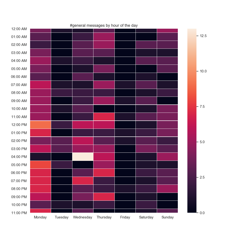
Here’s the final result for a test dataset I generated.
Every programmer’s bag of tricks is a little different. Maybe because of my functional programming background, mapping a lambda that parses and reformats hours popped into my head, whereas to someone else it may seem insane. Typing out all the days of the week feels like a waste of time in retrospect, but to someone who knows a good shortcut for that, clearly they’d use the shortcut instead. So much of scripting like this is data conversion (timestamps show up a lot in this particular case) that I think it really does pay off to know how to convert between formats of various things rapidly.
This isn’t the greatest code in the world, but it was supremely fast to write and I’m super happy with the bit of the result I care about—the heatmap!